I’ve been trying hard to take more photos – if not daily, as close to as possible. Sometimes nothing catches my eye. Then there are days like today where I come across an embarrassment of riches:

I caught this on the way into the office from coffee this morning. In real life, the sunlight was glinting off the wires, making them appear to glow. That wasn’t captured in the shot, so I processed this to give them the glow. I dig how the point of the building behind fits snugly into the intersection of the bus wires.
I had wires on the brain then. On our way to lunch, we crossed this alley:

Vancouver’s apparently going to be pulling down this old infrastructure and will bury the wires. But I love the character these old poles give our alleys, and now, with all the new buildings, the play between the clean, modern, angular towers and the somewhat rickety, right-angle-free power lines is enchanting. I edited to get this scratchy/old look to emphasize those differences.
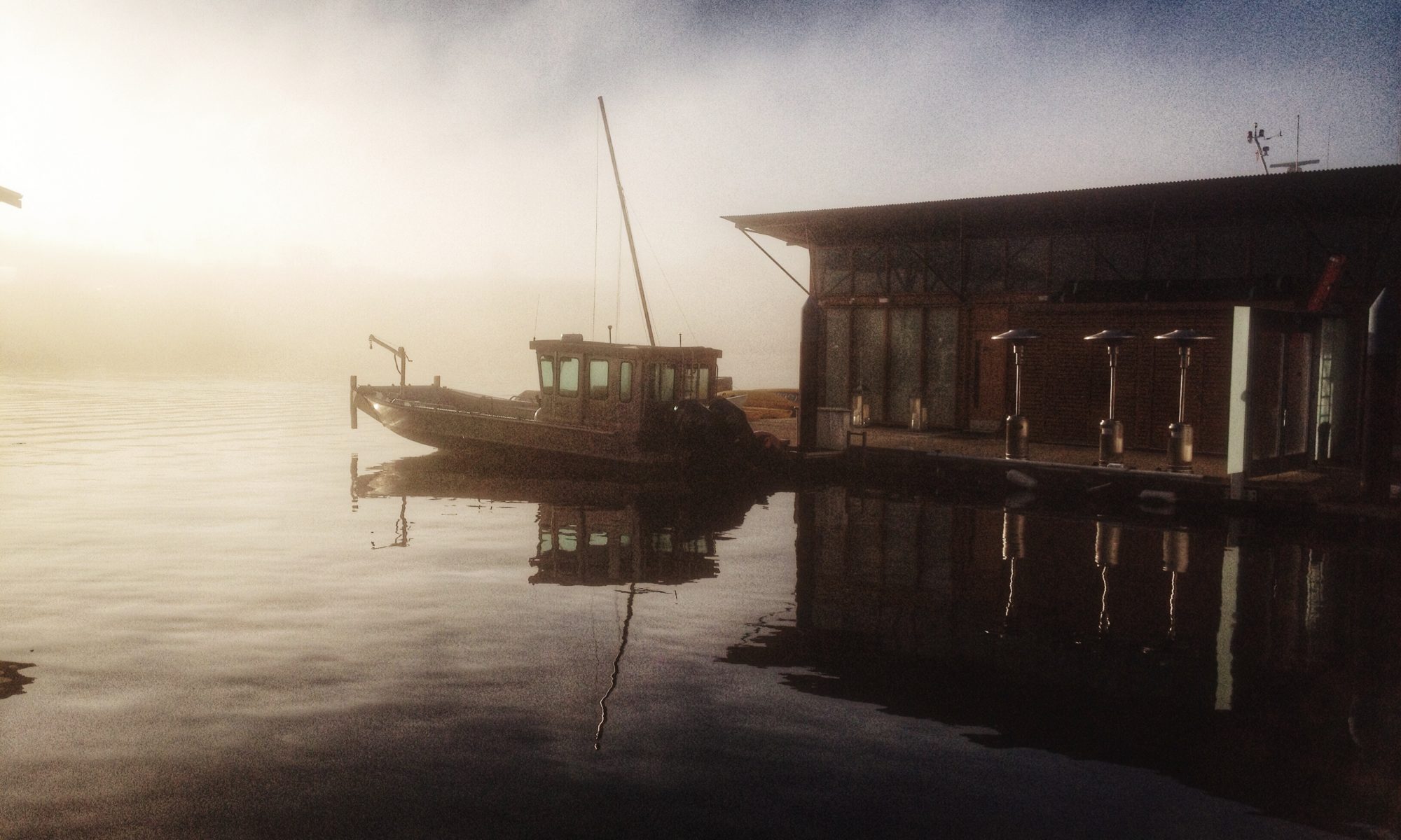
Continuing our theme of electricity, we had lunch at Sunset Burger a newish place on Nelson, with a definite California 80’s theme:

I didn’t do anything but apply an instagram frame/filter to this, but I don’t think it needed much.
After lunch I had to run an errand and just happened to walk under this:

I’ve worked in this neighbourhood for 15 years, and I’ve never been under this, nor into the Centre. I’m not thrilled with this photo, but it was a neat view to discover today.
My errand took me to the Central Post office:

I love the interplay of the at-angle, interlocking tile decoration above the flat utilitarian spread of post boxes. Gorgeous texture, and, in the glinting sunlight pouring in from outside, brilliant in the otherwise shadowed entry hall. I wanted to soften this one, and I selectively darkened the right-side (the hall) in snap-seed to further enhance the shiny of the boxes & tiles.
Finally, on the way back to the office I caught this:

And how could I not snap it? It’s intriguing? I’ve no idea if its a real message, or part of an ongoing ad campaign, or an art project? Again, just a quick snap. The poster itself is much more red than this filter would indicate.
In toronto, growing up, the bus-shelter ad-firm ran a series of ads that were a long these lines – a divorce + reconciliation or something that had the whole city talking because it was weeks before it was revealed what was behind the campaign – the point of which was exactly what it achieved – transit advertising gets both eyeballs and discussion (if anyone can find a link to some photos of those, it would be awesome. My Google-fu has failed me on finding it).